
Today, we're highlighting one of the 20 charts that vox.com published today in their 2020 wrap-up. This and two others have to do with COVID-19 and the novel coronavirus – though one could argue they all have to do with the virus or the pandemic in some way.
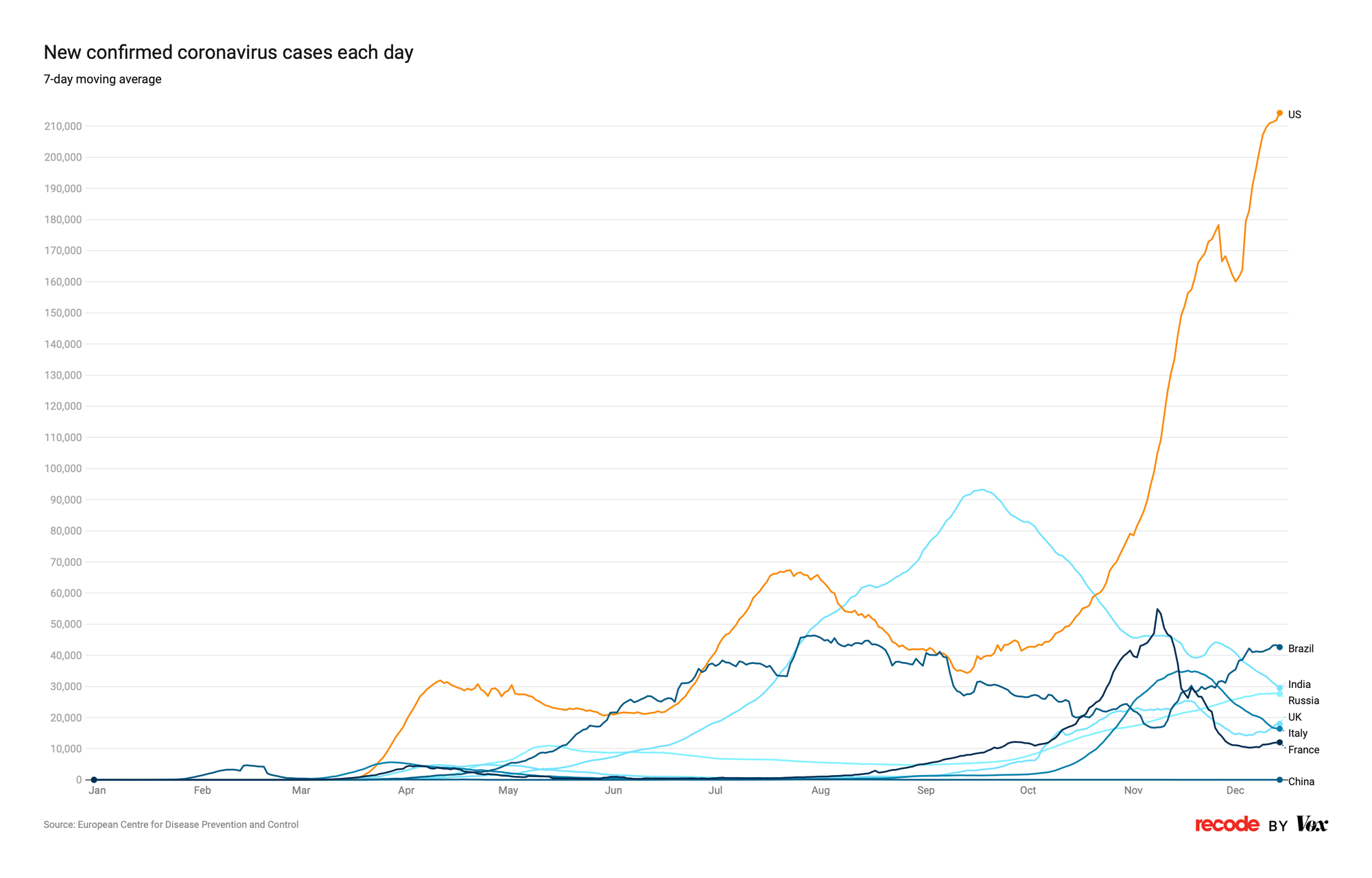
Above is the chart that shows new confirmed coronavirus cases each day this year as part of a 7-day moving average. See the whole write-up here: https://www.vox.com/recode/21727016/2020-in-charts-covid-vaccine-pandemic-election.
You can listen to the episode with Dr. Peter Chin-Hong here: https://www.howthisworks.show/4